The GoPotty app helps parents and children with potty training. Go Potty designed and developed the first version of the app in-house. To reach even more parents, they had big ambitions in creating a more accessible app. By including loads of videos and updating the UX the app is now ready for this bigger audience.
In the 1940’s children were potty trained around 1 year, as washing all these nappies was hard work! With the introduction of the disposable nappy, the need for potty training wasn’t as big. Currently children in the western world are potty trained on average at around 3 years old!
It is Go Potty’s goal to ditch the diaper sooner (sustainability goals), by providing the parents with an easy to use, step by step guidance in potty training.
Improving accessibility to reach a larger audience base
Go Potty has a free- and paid version of the app. The paid app gives you access to all content, step-by-step guidance and even expert consulting. Go Potty researched how we could reach a larger audience with the paid app, and the conclusions were:
- Adding more video and visual content.
- Applying UX conventions and using standard components, as people are familiar with these types of interaction.
We wanted to stay close to the current branding as there was no additional budget available to do a full overhaul. We re-used as many colours, fonts, elements of the existing app, paying attention to Web Accessibility Guidelines and checking contrast on the go.
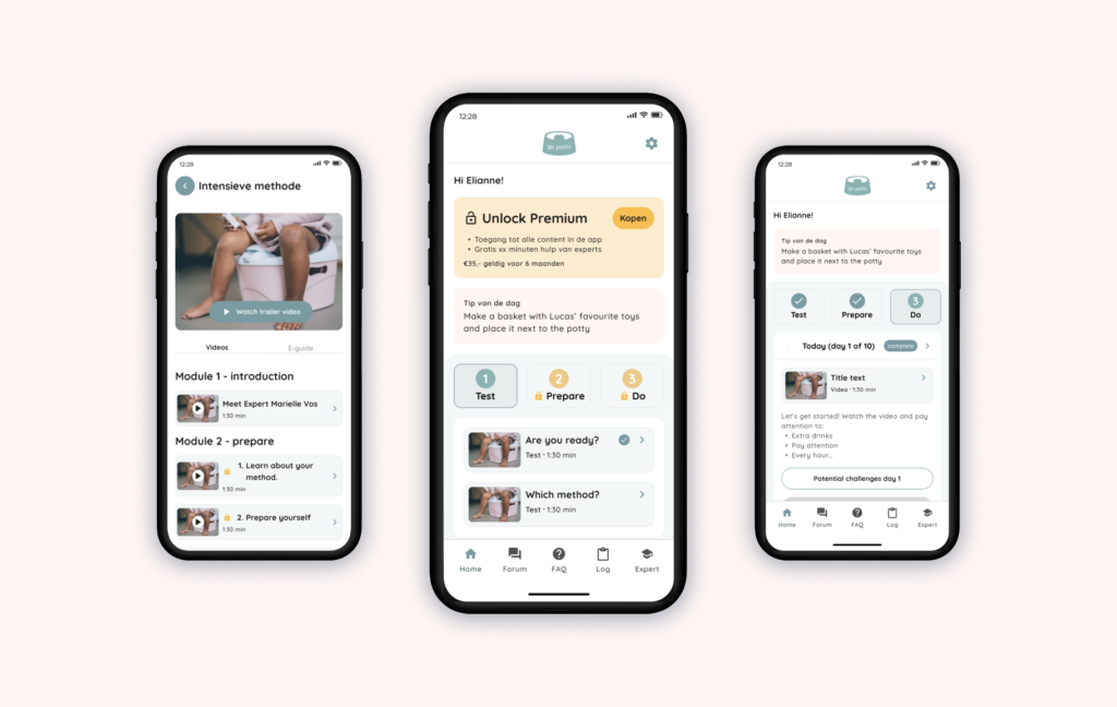
Home Screen
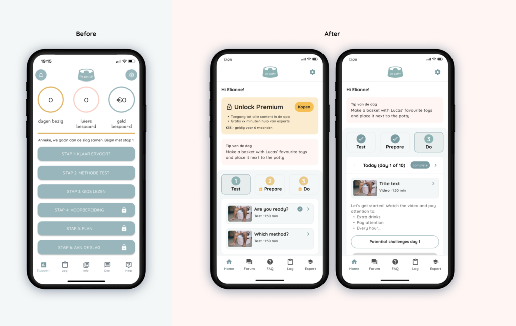
- Creating a Potty Training journey, it is not just a course but you want to show how they progress.
- Once you have begun, step 3 is the home-base for users to review what to do every day/week.
- Visually show which content is premium and which can be accessed by all.
- Create a desire for non-premium users to upgrade by showing them what to expect.
Video guide
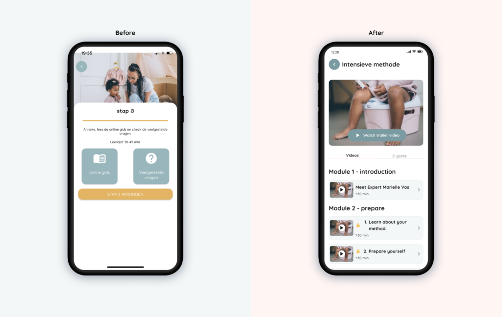
One of the biggest updates to the app was to provide the content about the two methods in a video format. Each module consist of 3-5 videos.
- It should be clear which content is only available for premium users, non-premium users should still be able to view the trailer and introductions.
- Show a video thumbnail, title, duration so users know what to expect.
- Create a more accessible e-guide, before an A4 PDF opened which was not suitable to be read from a mobile device.
Frequently asked questions
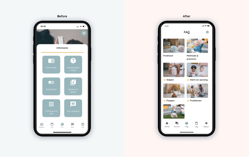
- Make it visually more attractive
- Make a good distinction between the information for premium and non-premium users
- Make good use of the screen: In the old design the photo on the top took a lot of space but at the same time the beautiful photos were covered by the content.
This project is a great example of how an UX review and applying standard conventions helps to improve accessibility of an app without the need to overhaul branding.
Date
2023
Client
Go Potty